
Confidential Computing on AWS: Protecting Data in Use with Nitro Enclaves
08 April 2026 - 9 min. read
Alessio Gandini
Cloud-native Development Line Manager

In this series of articles, we are describing how to properly create and structure a self-service Data Platform for data democratization analytics on AWS.
We started with data ingestion and storage. Then, we moved through processing tools to create valuable data for analytics, visualizations, and reporting. Moreover, we will focus on data governance, discoverability, and collaboration, with an eye on security and access control.
Follow this article to learn how to extract the real value from your data using SageMaker to create a Machine Learning model to forecast sales data, and QuickSight to create visualizations to show how the model forecasts future data.
This article concludes this series, started with the description of data platforms, and related data pipelines, described in Chapter 1. Then, data governance and the explanation of democratizing data access through a self-service data platform, using AWS LakeFormation, in Chapter 2.
Extract the maximum value from data by building applications on it, like Machine Learning (ML) models for forecasting or Business Intelligence (BI) reports to visualize trends. Use the SageMaker Unified Studio Experience features to create the ML model. Perform Exploratory Data Analysis (EDA) using notebooks, train several models with (visual) pipelines, and select the best one from the model registry. Create dashboards and reports using AWS QuickSight to show model forecast predictions, along with other metrics and KPIs.
In the previous articles of this series, we learned what a modern data platform is, how to properly structure it with the medallion architecture, and how to implement it on AWS. With the data platform as the foundation of our data architecture, we then focused on the application of data governance and data democratization in the second chapter, using AWS LakeFormation. By establishing a well-architected data lake with AWS LakeFormation, we've seen how companies can break down traditional data silos while maintaining appropriate security and governance controls. We examined how organizations can transform raw data assets into accessible, governed resources that empower teams across the business. This democratization of data creates the essential foundation for what comes next in the data value chain.
In this third chapter, we'll shift our focus from data infrastructure to data applications, the powerful tools and systems that transform structured data into actionable insights.
Specifically, we'll explore how machine learning models and data visualization techniques can be deployed on AWS to extract maximum value from your data platform.
These applications represent the last mile of our data journey, where properly organized, accessible data becomes the fuel for predictive analytics and decision-making that drive business outcomes.
If you read the first of this series of articles you already know what we are working with but, to get everyone on the same page, here is a very brief overview of the setup.
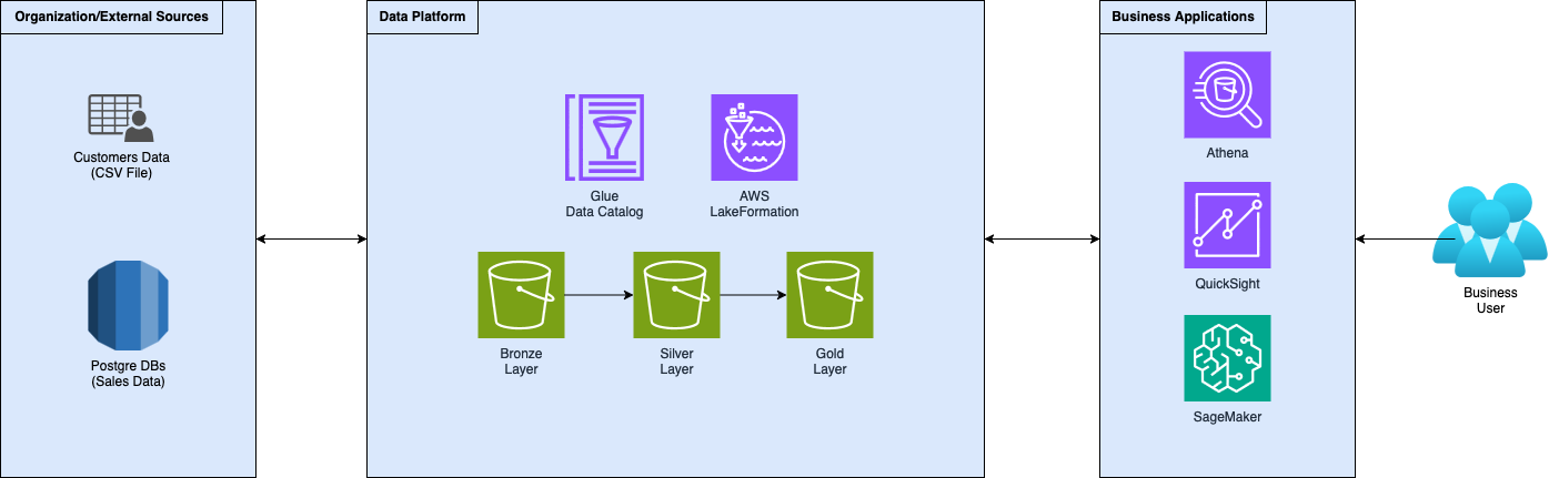
Acting as data engineers for a fictional company that helps its customers increase their revenues, we created a data platform following the standard medallion architecture. We developed ingestion and transformation logic to gather data and move it through the increasingly refined layers of the data platform. Then, we implemented governance using AWS LakeFormation, making data accessible to internal teams and customers.
Some time passed since our customer adopted the proposed strategy to increase sales and he's pretty happy with it but is asking: “How far can we go with this strategy?”. The company now asks us to start extracting real value from and help your customer.
The idea is now to create a model that, taking past months’ sales data, forecasts sales for the next year, month by month. We also want to show the customer various insights to help the creation of the sales strategy for the next period. Our idea is to show them the forecasted sales trendline and their best selling-products, alongside the worst-selling products, so that they can take better decisions by deciding which products are worth selling and what can be dropped.
Now that we set the goals, let’s introduce our first tool inside our Swiss knife.
For the more observant among you, in the last chapter, we wrote about showing Amazon DataZone, a tool that builds on top of AWS LakeFormation, to handle data governance and sharing easily. However, the whole AWS AI ecosystem is being re-designed and re-branded, lucky us!
Everything now falls under the SageMaker landing page which routes us through the various AI services, from data warehouses and query engines (Athena and Redshift), data transformations (EMR and Glue), modeling (SageMaker AI, ex. SageMaker), generativeAI (Bedrock), and data governance (LakeFormation and DataZone).
As a consequence, also the various “Studio” experiences were aggregated into a single, comprehensive suite called Amazon SageMaker Unified Studio. This new Studio experience should cover the whole data journey from the very beginning up to the final product: the AI application. From the basics of data processing, model development, or generative AI, up to deployment at scale, supporting the work with notebooks and built-in SQL editor. The SageMaker Unified Studio has DataZone capabilities, so you can organize assets and users under “domains” and promote collaboration through “projects”.
We will use the SageMaker Unified Studio to create our ML model.
Using the Amazon SageMaker Unified Studio, let’s start with the creation of our first data application: the Machine Learning model.
To build a machine learning model is essential to have data and, most importantly, to know and understand your data. Let’s start by gathering the data and performing some EDA.
We have data, already cleaned and prepared, inside our gold layer. Let’s load it and start doing some analysis on it.
One of the features of the SageMaker Unified Studio is notebook instances, we will use one as our processing unit to explore our data. Here’s what the notebook experience looks like inside the studio:
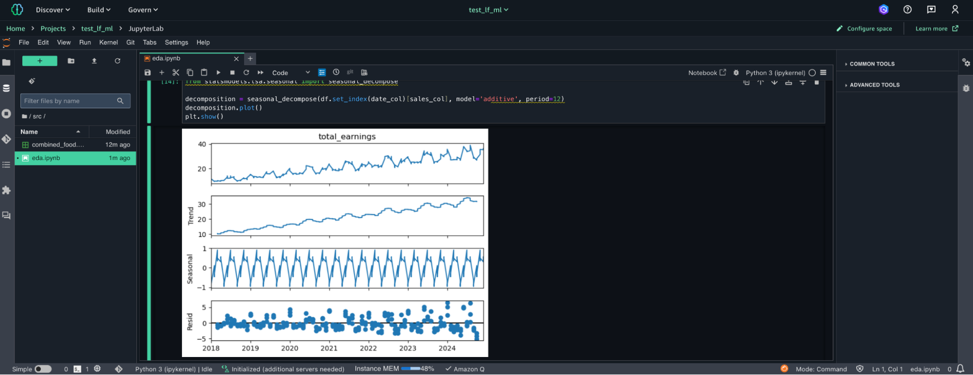
As you may remember from the previous episodes of this series of articles, we are using sample data, specifically crafted to create this example. This helps us since during the creation process we specified the statistical properties of the data.
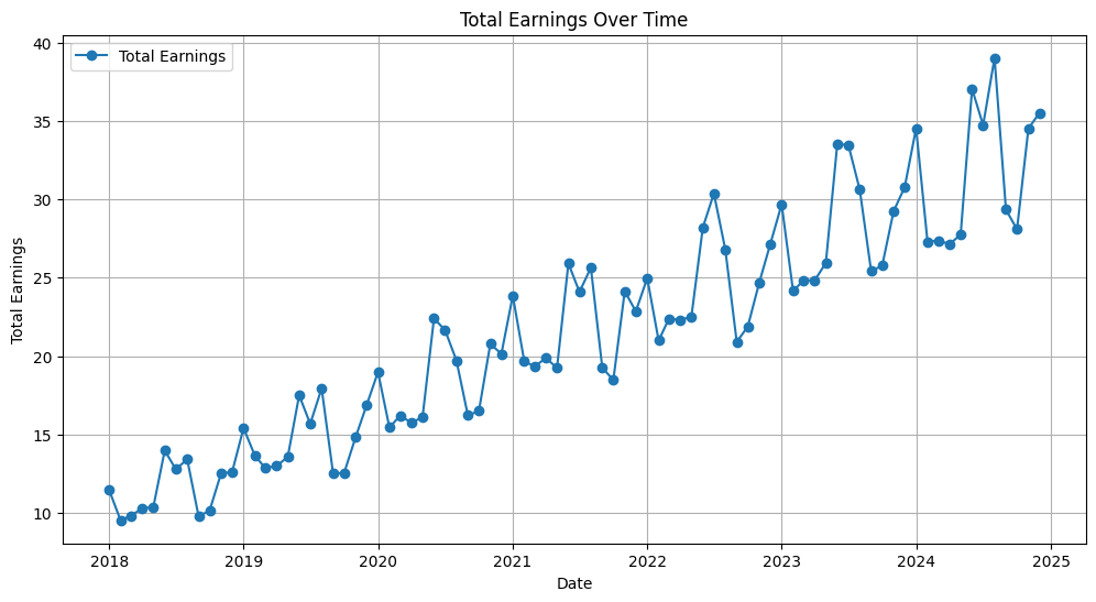
Without further explanation, let’s see what comes out of our EDA:
Here is a graph that represents the description of the data:
Now we have a good understanding of our data, and the related statistical properties. This kind of knowledge is crucial for this next section: It’s modeling time!
We are working with time-series data, aiming to forecast sales for the future months, therefore, we try to find a good model from a simple selection of what could be a good fit for this use-case:
To find the best model inside this group, we need to define a test set.
We have 7 years of data, therefore, we can fit our models on the whole dataset, split from the last year, which we can use as our test set.
We can train our models with another feature of the SageMaker Unified Studio: Pipelines.
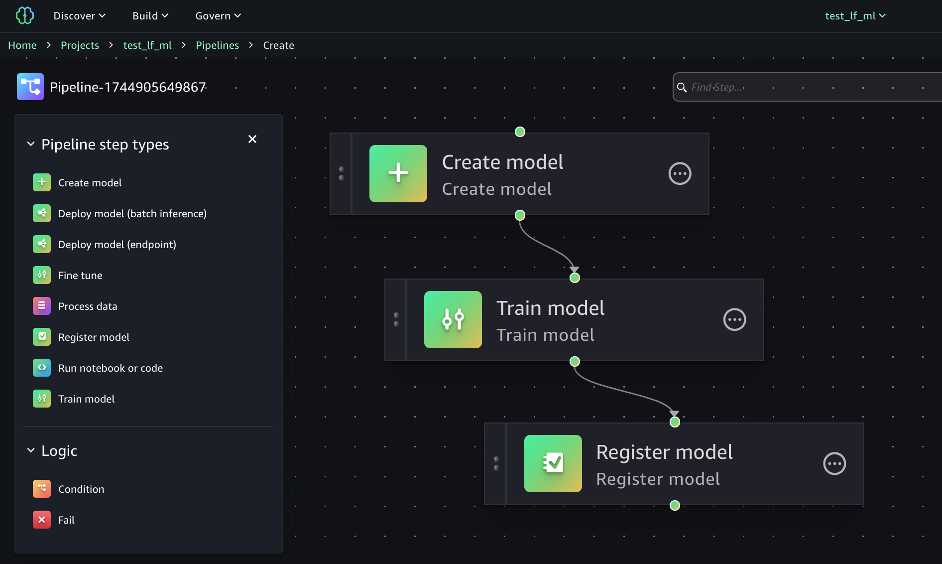
We can create the entire ML pipeline with a few clicks, using the visual editor.
As you can see from the image, you have several possibilities in the definition of your ML Pipeline and you can do whatever you need.
In our example, we need a few steps: define the model, train it, and register it inside the model registry, so we can find its metrics and verify the quality of the given model.
After we trained all our models, we find out that the best model is: the Prophet!
To be fair, all models are very close to each other in terms of quality since they are trained on sample data, purposely crafted for this task.
Now that we have our best model, we can use it to predict the sales for the next months and use it in our next section: data visualization and business intelligence.
Now that we have our sales forecasting for the next year, let’s complement it with BI.
Business Intelligence (BI) aims to transform data into actionable insights through interactive dashboards and reports, by tracking KPIs and visualizing trends, enabling better decision-making.
Back to our storytelling, we can show to our fictional customer various insights, like how the sales strategy that you proposed will perform during the next year. Also, we may want to show to our customer their best selling products, alongside with the worst selling products, so that they can decide which products are worth selling and what can be dropped.
Let’s create this dashboard with AWS QuickSight.
First, we need to load our data by importing it into the Datasets section.
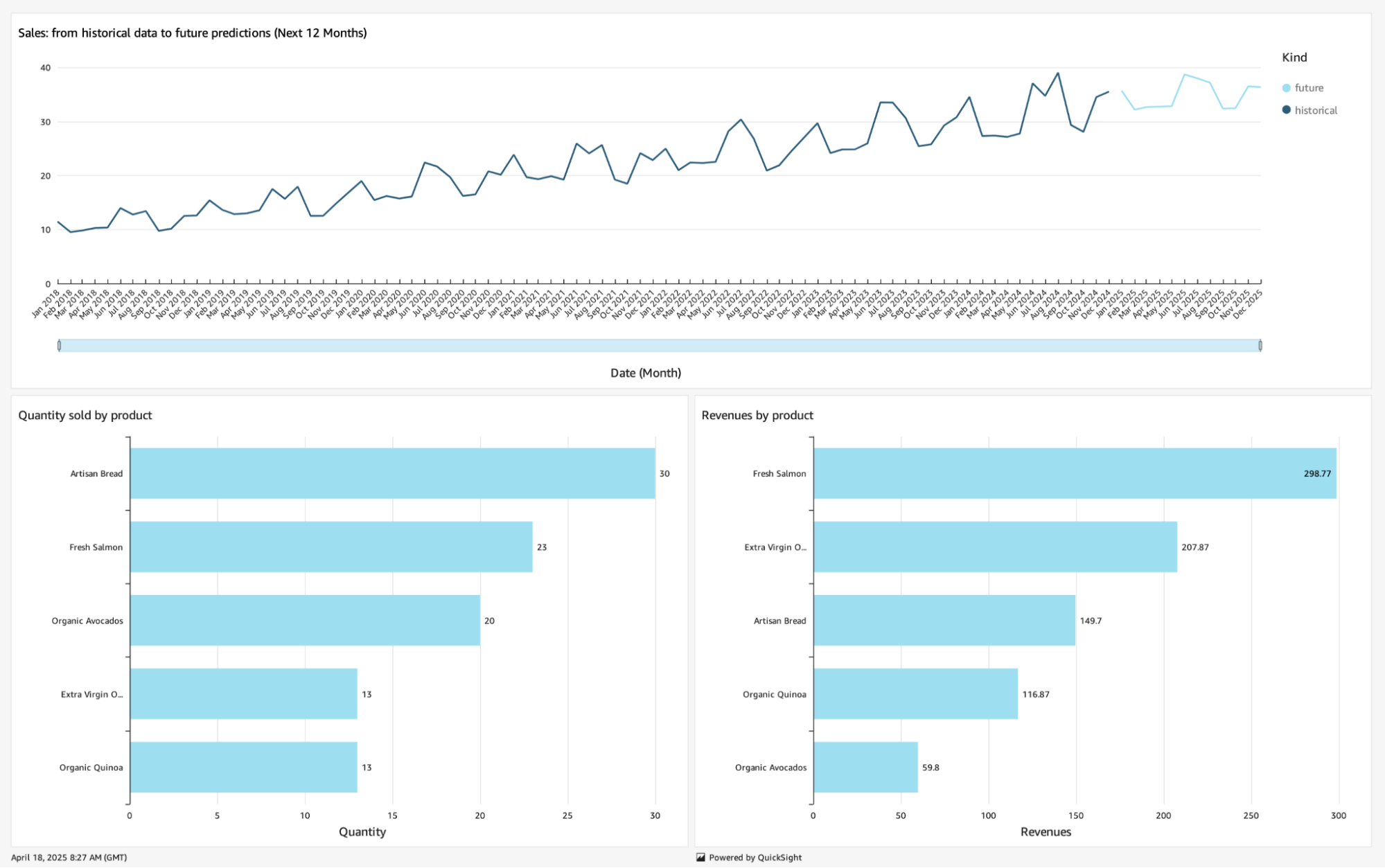
To project the future sales we created a prediction file, which also contains historical data, that we can directly import.
Regarding the best-selling and worst-selling products, we have this data inside our silver layer of the data platform. We import this data using an Athena connection with a custom query:
SELECT product, sum(quantity) as qta_sold, sum(quantity*price) as revenues
FROM "sales-processed-db"."lf_food_processed"
GROUP BY product;
Now that we have our data loaded in AWS QuickSight, we create an Analysis to try some visualizations.
We can use a line chart to plot future sales data, differentiating historical data from our predictions. Meanwhile, bar charts can be used to show how products are selling with respect to quantity and revenues.
Once we are happy with the result, we can publish our Analysis as a Dashboard so that users can start benefiting from it. Here is what it looks like with our data:
In this series of articles, we've completed our data journey: from the creation of a data platform as the central repository of data, to the extraction of real value from data by creating applications on top of it passing from data democratization and data governance using AWS LakeFormation.
We explored the SageMaker Unified Studio Experience, performing exploratory data analysis (EDA) using notebooks, and, creating an AI model able to forecast future time-series data, using Pipelines and the Model Registry.
Lastly, we valorize our model forecasting by showing it with AWS QuickSight dashboards, along with additional visualizations that may be useful for decision-making processes.
We hope you enjoyed staying with us! Feel free to share your thoughts, opinions, and feelings in the comments section!
Proud2beCloud is a blog by beSharp, an Italian APN Premier Consulting Partner expert in designing, implementing, and managing complex Cloud infrastructures and advanced services on AWS. Before being writers, we are Cloud Experts working daily with AWS services since 2007. We are hungry readers, innovative builders, and gem-seekers. On Proud2beCloud, we regularly share our best AWS pro tips, configuration insights, in-depth news, tips&tricks, how-tos, and many other resources. Take part in the discussion!